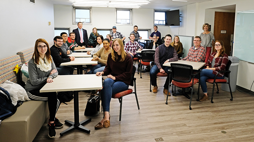
College of Optometry students hang out in the student lounge, dubbed “the pupil place” by popular vote. Back row from left: Nick Palisch, director of student and alumni services; Jessica Weiss; Taylor Wolkart; Aric Waltz; Stephen Wells. Seated on bench from front: Alaina Altenbernd, Matt Falconer, Jialin Su, Torvín Rajala. Seated opposite bench from front: Elizabeth Voss, Jasmin Welch, Kaleigh Albers, Meghan Guinotte. Front table from left: Conor Haugen, Brad Cary, Janessa Visin. Back table from left: Kyle Carnahan, Molly Huck, Meagan Anderson. Standing at right: Janice White, interactive graphic designer. (Photos by August Jennewein).
Anyone who has come into contact with optometry students know they love a play on words, which is why the recent Marillac Hall updates began with a pun versus pun situation.
“The pupil place” squared off against “the focal point.”
Both were student-generated submissions to name the University of Missouri–St. Louis College of Optometry’s student lounge and main gathering area. Christening it was the jumping-off point for a makeover to address student success and to enhance new student recruitment. In the end, “the focal point” won out.
Last fall, students approached Nick Palisch, director of student and alumni services, because they needed more study spaces, and anyone who has come into contact with Palisch knows he takes students’ needs seriously.
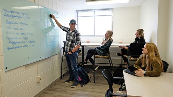
The student design committee made sure the update included plenty of hard-top study spaces. From left: Taylor Wolkart, Kaligh Albers, Molly Huck, Meagan Anderson.
Which is how, less than a year later, four floors of optometry space in Marillac Hall have been updated to both refresh existing study spaces and create new ones in the college. The second floor, which previously housed the pediatric exam rooms and now is student practice space, was renovated with new floors, paint and lighting; to expand the number of practice lanes from 11 to 22 and to include new technology, such as digital acuity charts.
“Students who study on campus typically do better in the program than those who leave campus,” Palisch said. “I think we now have the ability to serve our students with critical space to do just that.”
With 23 optometry schools competing for a relatively unchanging pool of incoming students, Marillac’s makeover will help UMSL contend.
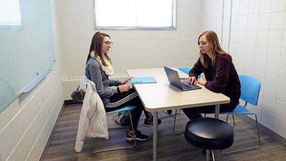
Alaina Altenbernd (left) and Elizabeth Voss (right) test out one of the cozy study spaces in Marillac Hall.
“Applicants have choices, and we know that,” Palisch said. “At the end of the day, it’s not just about the cost of tuition, per se, it’s really about whether or not they can see themselves here. If you’re not investing in your institution and your buildings, that shows.”
To put together the most effective spaces, Palisch decided to form a renovation-design student committee and put out a call to frequent on-campus studiers. Aside from himself and Interactive Graphic Designer Janice White, the committee comprised second-year students Megan Anderson, Matt Martinez, Janessa Visin and Taylor Wolkart as well as third-year students Krystal Matson and Aric Waltz.
They got down to the work of design, looking for unused areas and nooks in Marillac that could become study spaces and then figuring out what elements should be included. The group visited three furniture vendors and selected Modern Business Interiors in St. Charles, Missouri.
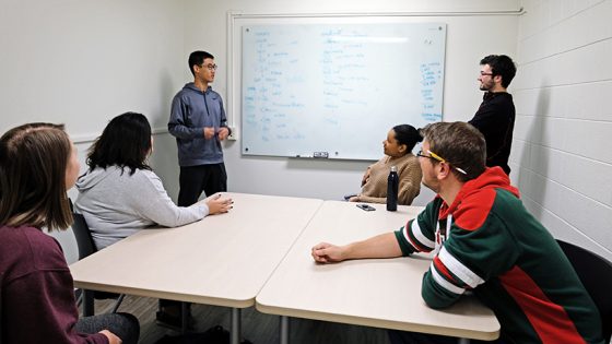
The larger study spaces and new whiteboards allow students to collaborate in their learning. Standing in back: Jialin Su (left) and Matt Falconer (right). Seated at table, clockwise, Jasmin Welch, Torvin Rajala, Meghan Guinotte, Kaligh Albers.
“When you work in government education, you have to go through a bidding process where we say as a university, ‘We’re looking for x, y and z,’ and then we have to consider multiple, different companies,” said Matson. “We had to consider and weigh the pros and cons of each of them. Quality of the product was really important to us because we’re hoping that these facilities last us for quite some time. Cost, of course, because you want to be cost-effective. Customer service was a huge thing for us.”
For Matson, the design process was “eye-opening.”
“It was cool to see that, while we’re in the niche of eyeballs, and that’s what we do all day, there are people who specialize in furniture and design, too,” she said. “It was a whole new world that I didn’t know anything about. We all get dressed in the morning and have to think about matching, but to have to worry about this swatch compared to that swatch was interesting. There were so many different table colors. We’d walk up, and there’d be a wall of different woods and different shades of wood.”
The group considered what Matson calls the “functional” aesthetics of the spaces: hard study spaces versus soft lounging areas, table height and shape as well as appropriate dimmable lighting for testing color vision and acuity. Then White put together fabric swatches, focusing on creating pop with bright colors.
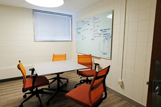
Even after all the optometry students have, at last, gone home, traces of their presence remain in the form of notes and filled trashcans.
The contractors finished on time, and the incoming class was pleasantly shocked by Marillac’s transformation, which doubled the amount of study areas.
“It has just blossomed into this gorgeous new optometry facility,” Matson said. “It’s not uncommon to spend 12 to 16 hours a day studying, and I would say student time on campus has probably doubled. It’s really easy to loaf off at home and get distracted with the dishes and stuff, so students really rely on that campus space to efficiently study.”
Some of the new spaces – like first-floor study areas designed like restaurant booths – have become so popular that students claim them as early as 4 in the morning. Plus, the soft chairs for catnaps, microwaves and water fountain ensure a comfortable all-day space, which comes in especially handy for third-year students preparing for boards.
“The most rewarding thing is that students are using it,” Palisch said. “Every study space is being utilized, and you can see it because trash cans are full. The desks are being used, and that’s great. That’s our return on our investment.”


