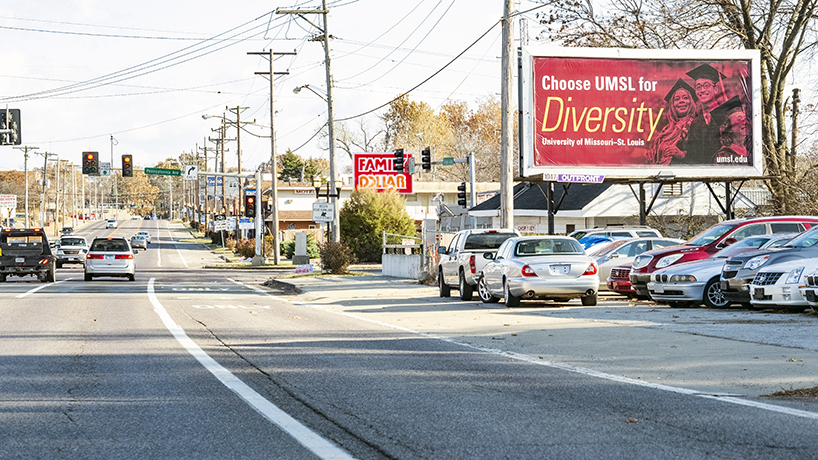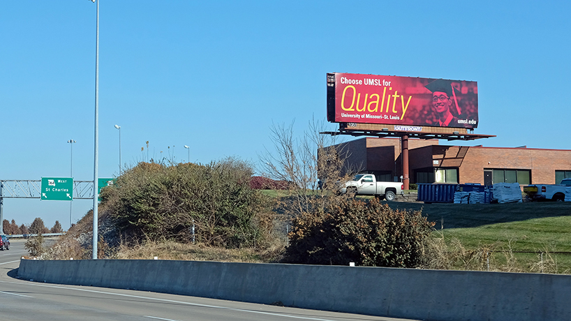
A new marketing campaign from University Marketing and Communications uses six pride points – Affordability, Connections, Diversity, Flexibility, Scholarships and Quality – to build awareness of UMSL in the St. Louis area. (Photos by August Jennwein)
Right at the beginning of November, the first billboard popped up proudly displaying the word Diversity on a background of UMSL red on the corner of Kingshighway and Vandeventer. By the time the second week of the month rolled around, there were red signs throughout St. Louis displaying a host of University of Missouri–St. Louis pride points: Affordability, Connections, Diversity, Flexibility, Scholarships and Quality.
Those words make up the backbone of a new University Marketing and Communications campaign intended to increase awareness of UMSL in the greater St. Louis area.
The campaign launched on Nov. 4 and includes outdoor billboards, streaming and terrestrial radio, cinema ads, digital advertising and a custom landing page. It comes from the minds of Senior Director of Marketing Judith Kaplan and Creative Services Manager Jami Hirsch and is intended to build awareness of the university to prospective students of all varieties and solidify the connection between “UMSL” and “University of Missouri–St. Louis” in the area’s minds.
To gauge how successful the campaign might be, I decided to take the artwork on a field test. I printed out the six billboard designs and took them to the Millennium Student Center to get some current student takes.
The graphics drew praise for their design from freshman Romi Hanin, whom I found studying in the MSC rotunda.
“I like the design a lot,” he noted. “They’re really simple and clean.”
Hanin, whose heritage is Arabic and Brazilian, felt connected to the Diversity billboards, which he’s noticed on his drive to school. Sophomore Brian Chen, an international student from China, felt similarly.
To Hanin, UMSL’s demographics feel akin to where he grew up in North County and make him feel at home here. That’s part of why he chose UMSL. The other half was friends who’d also studied computer science here and found jobs thanks to that department’s connections. So that billboard – and Quality – drew him in as well.
The campaign is intended to solidify the connection between “UMSL” and “University of Missouri–St. Louis.”
Connections was also meaningful for junior Audrey Forth, who was working in the Welcome Center with Abby Foster. Forth, a College of Education student, found UMSL thanks to faculty outreach.
“When I said I was going to UMSL, a lot of my former teachers were like, ‘Oh, I went there for undergrad, or I went back there to school, and I love it,’” Forth said. “It was cool to see the connections that they had formed through UMSL that were helping me transition into it as well.”
Forth and Foster both told me that Scholarships and Affordability were meaningful to them as well and tied together in their minds.
“If you get a 28 on the ACT, then you have over half of your tuition paid for, which is kind of insane,” Foster said. “In the St. Louis area, UMSL is 10 times more affordable than any other institution.”
The two also recognized one of their former Welcome Center coworkers on the billboard, which they liked. That’s something echoed to me by Joi Molloyd, a senior in the College of Nursing who was hanging out with friends outside Einstein’s in the MSC.
“I know some of those people personally on the billboards, so I think that drew me to them,” she said. “It was a blast. I worked with them at the Rec Center, so it was cool to see actually people that I know succeed.”
Showing images of students graduating at an actual UMSL Commencement is how Hirsch and Web Designer Lori Austin hoped to make viewers connect given the form’s word count limitations – seven is considered ideal for billboards – so this is good news for the creative team.
Forth got it right away when she saw the designs.
“I think it shows the end result,” the junior said. “I like that they’re all smiling and happy to be graduating.”
Regardless of what each specific student took away from the images, a common theme in what they told me was that they were happy for UMSL to have visibility around the area.
Molloyd’s friend and fellow nursing student Aby Sall put it best.
“It makes me proud to go to UMSL,” the junior said.
The campaign and assets were designed by Kaplan, Hirsh and Austin with Interim Assistant Vice Chancellor Justin Roberts, Graphic Designer Marty Baragiola, Web Developer Fernando Sucre and Digital Content Specialist Timothy Wombles.

