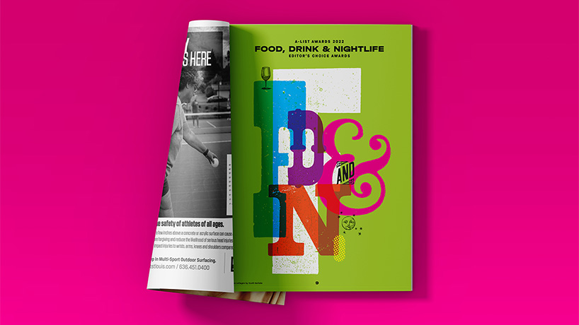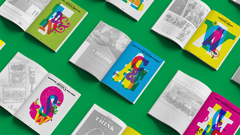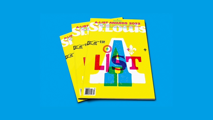
UMSL professor Scott Gericke was tapped to design the July issue of St. Louis Magazine. (Image courtesy of Scott Gericke)
A University of Missouri—St. Louis professor is showing off his design chops in the latest issue of St. Louis Magazine.
Scott Gericke, an assistant teaching professor in the Department of Art & Design at UMSL, was commissioned to design the cover package for the publication’s July issue. The feature honors the winners of the magazine’s annual A-List Awards, featuring top picks for local dining, arts, shopping, startups, sports, entertainment and more as chosen by readers and editors.
Gericke, who teaches sophomore and senior level graphic design courses, was brought on for the project by SLM Design Director Tom White, who has for several years offered critiques on publication design projects for Gericke’s classes. In addition to his work in the classroom, Gericke maintains his own practice – he counts Ameren Corporation, Coca-Cola, Companion Bakery and St. Louis Children’s Hospital among his clients and collaborators – and the two had often spoke of working together at the magazine, particularly on a letterpress project.
“He’s got a wonderful sense of experimentation and creativity when it comes to using the letterpress,” White said. “The letterpress is such a historic and ancient process – to me, it really has design essence just embedded in it, partly because it was one of the very first processes that designers were using to produce print products. Scott has a lot of experience using them, but beyond that, it’s just obvious that he has fun with that; he takes the medium to a really fun level.
“Most people recognize the letterpress and typesetting as a neat and organized form of design, but Scott utilizes the medium to create more alternative and experimental designs that are fun and exciting. And for A-List, we’re talking about a celebration of the best of St. Louis, so we wanted to evoke that celebratory and fun essence.”
For the A-List design, Gericke utilized wood and metal type and line cuts both from UMSL and Central Print, a nonprofit arts organization based in north St. Louis that strives to promote the art of letterpress printmaking. Thanks to a partnership with the St. Louis Mercantile Library, Central Print is home to The Printery Book Arts Lab, which offers high-quality letterpress equipment and type inventory from a historic private press.
To introduce each of the categories, such as “Food, Drink & Nightlife,” “Arts, Culture & Entertainment” and “News, Science & Startups,” Gericke designed striking splash pages with a bold CMYK (cyan, magenta, yellow and black) palette. On each opener, he played around with the size and scale of the first letter of the category and featured a few corresponding line cuts to go with the theme. Also referred to as dingbats, the latter refers to typographical ornaments that feature icons or images as opposed to words or numbers – think a wine glass, shoe or star. For the bright yellow cover, for instance, he incorporated a few fleur-de-lis symbols to subtly hint at the city’s French heritage.
“They’re kind of nostalgic,” Gericke said. “Just really simple, clean images that printers used to use way back in the day when they were developing ads for clients in newspapers and such. We have a small collection [at UMSL] but Central Print has a really awesome collection divided by categories and organized in several drawers. For me, it’s an approachable aesthetic that still holds true and people connect to it.”
Gericke is quick to acknowledge that he could have easily achieved a similar look for a lot less work by simply using fonts and typefaces that he has on his computer. But he believes that the art of the traditional letterpress lends a unique quality to the design that can’t be replicated elsewhere.
“The tactile and uniqueness of printing a letter on a printing press on a fiber-y piece of paper lends texture or an almost low-tech quality to it,” he said. “You can really see the holes and the pits and the fuzzy edges – it’s almost like it was stamped on there – which you just can’t achieve with anything digital. What’s exciting to me is that it’s an old technology used in a newer way. When you look at the image on the cover, it definitely grabs your attention. You can tell that it’s old school and kind of messy, but there’s still something sort of endearing about it.”

