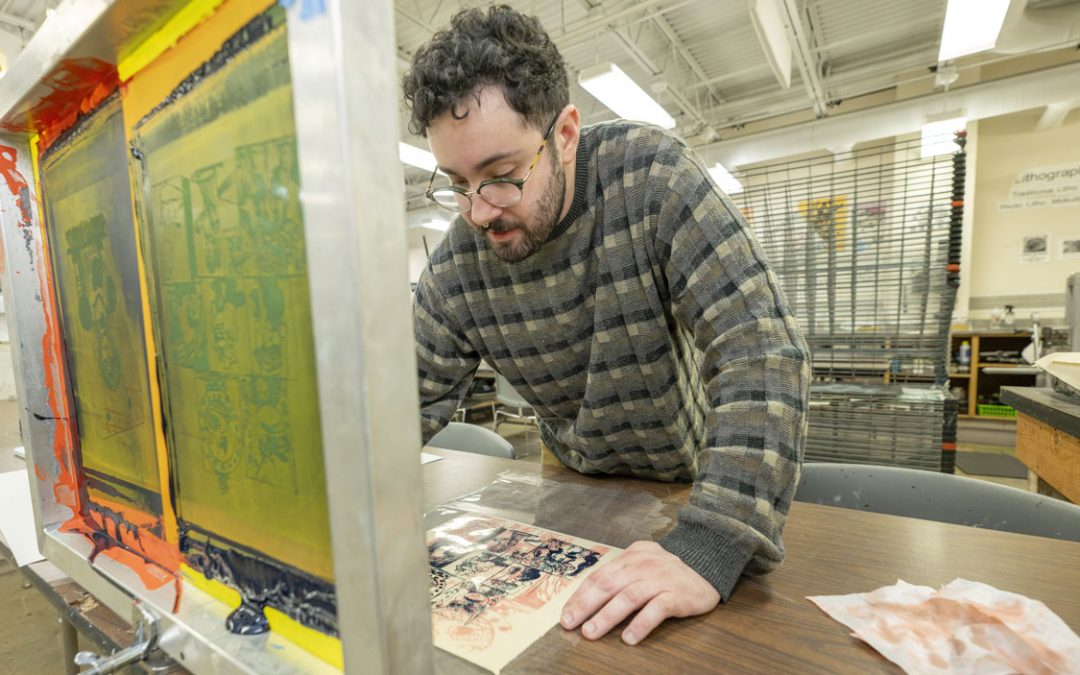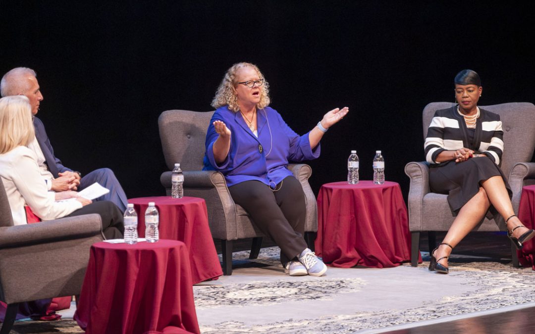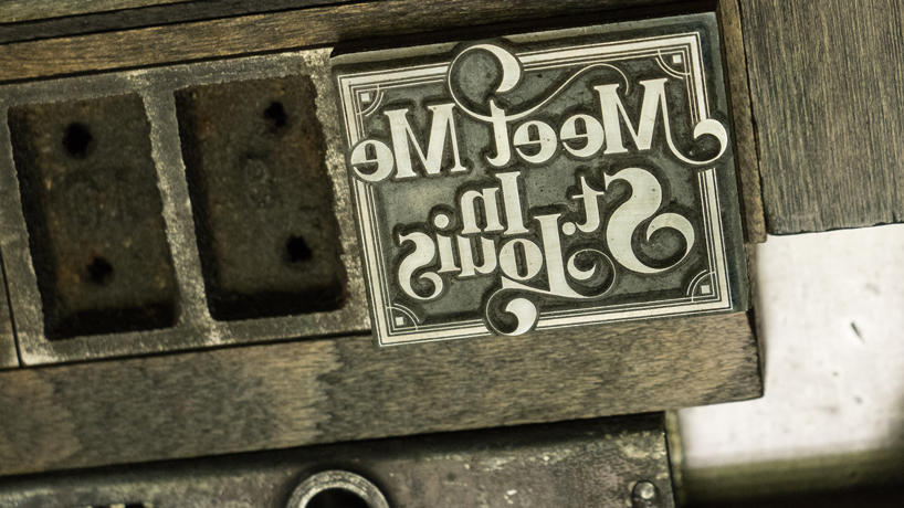
The exhibition “Cast and Recast: St. Louis Type Past and Present,” on view at UMSL’s Gallery 210 on North Campus through May 14, celebrates St. Louis’ rich history as the first major type foundry city in the Midwest. (Images courtesy Gallery 210)
While scrolling through a list of popular typefaces in a computer program, the history and artistry behind the choices – Arial, Garamond, Rockwell and so on – is easy to miss. But making typefaces is in fact “an insanely precise craft,” as Jennifer McKnight puts it.
“Each letter is a tiny sculpture,” says McKnight, an associate professor of art and art history at the University of Missouri–St. Louis. “It’s like carving the head of a pin to create a letter at, say, four or six point. But that’s not all. You don’t just make one carved sculpture – you have to make a set of 26 uppercase letters, then 26 lowercase letters, then numbers zero through nine, then punctuation.”
That typically works out to a total of 70 or 80 very small carvings – all done through a magnifying glass, McKnight explains – and they all have to match.

The “Cast and Recast” exhibition is on view at UMSL’s Gallery 210 from 11 a.m. to 5 p.m. Tuesday to Saturday through May 14.
“It’s amazing,” she says. “It took the skill of some very talented engravers – immigrants from Germany to the St. Louis region, in this case – to create these pieces of type.”
McKnight is referring to items currently on display at UMSL’s Gallery 210 as part of “Cast and Recast: St. Louis Type Past and Present.” Featuring original metal typeface samples on loan from Firecracker Press, 19th-century broadsides from the Missouri History Museum and a newly unveiled typeface from St. Louis-based designer Ben Kiel among other materials, the exhibition offers a colorful glimpse at the ways in which design has shaped – and continues to shape – St. Louis and the surrounding nation.
“These typefaces changed the country between 1840 and 1920,” McKnight says. “‘Cast and Recast’ is a show about how good ideas can change our city – and shows how we did it 150 years ago and how we can still do it today.”
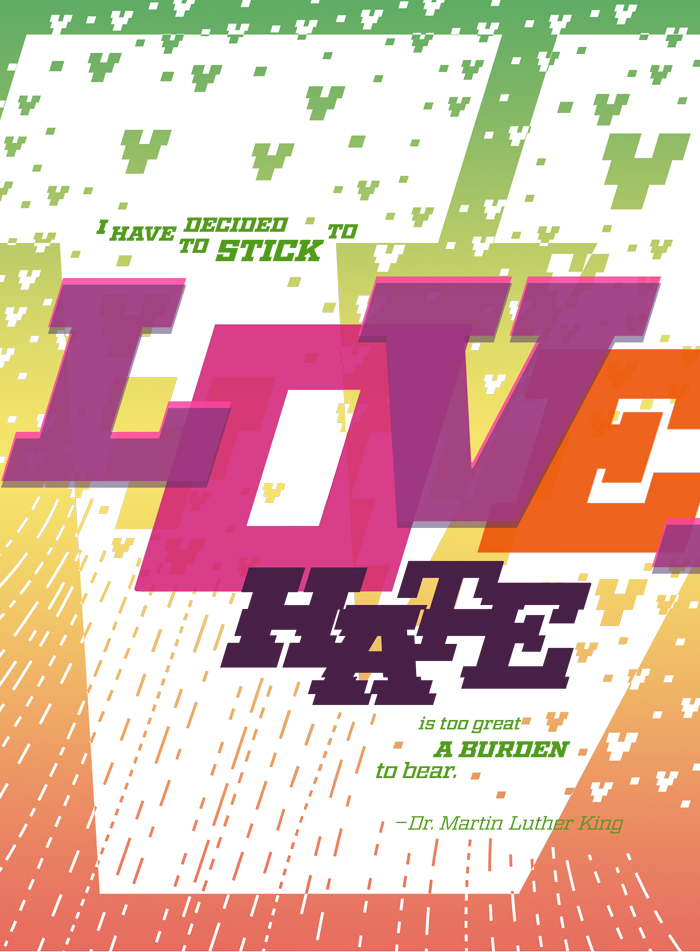
UMSL’s Jennifer McKnight, co-curator of “Cast and Recast,” is also one of 22 local artists who created pieces for the show using a new typeface by St. Louis-based designer Ben Kiel.
Working closely with her colleague Terry Suhre, the director of Gallery 210, and with Kiel to design and co-curate the exhibit, she’s delighted with the fruit of their efforts. And “Cast and Recast” isn’t merely for typeface enthusiasts, she notes – anyone with an interest in St. Louis or American history is likely to find the exhibit fascinating.
“It’s pretty exciting what St. Louis type foundries did for the western frontier,” she says. “Before 1840, newspapers had to get their metal type for typesetting the newspaper from Philadelphia or from Europe. Imagine how expensive that was, and how long you had to wait. When the St. Louis Type Foundry opened in 1840, there was a huge renaissance for the printing industry.”
St. Louis has continued to play a significant role in the history of typeface design – with Arte Gothic and Rockwell, among many other typefaces, “just as much a part of the DNA of our city” as the artwork adorning a building like St. Louis Union Station downtown, McKnight says.
“Every time you look at a World’s Fair poster or invitation, you are enjoying – whether you know it or not – the mood set by St. Louis typefaces,” she says. “But even if you don’t care about typefaces, it’s pretty exciting what St. Louis type foundries did for the western frontier.”
Along with materials showcasing the process of casting and designing hot metal type, historical posters and much more, the exhibit features work by 22 local graphic designers and typographers working with Kiel’s new typeface, which is a revival of the Geometric Italic design created at a late-19th-century St. Louis foundry.
Free and open to the public, “Cast and Recast” runs through May 14 at Gallery 210, which is open Tuesdays through Saturdays from 11 a.m. to 5 p.m.
Media coverage:
St. Louis Public Radio


